01.5 / Case Study Slides
Full Presentation
The complete case study deck — covering the kiosk overview, research methodology, focus group findings, user personas, and proposed improvements. Click any slide to enlarge.
Evaluating the self-service kiosk experience at NC A&T's campus Chick-fil-A and proposing UX improvements to reduce friction for students between classes.
The complete case study deck — covering the kiosk overview, research methodology, focus group findings, user personas, and proposed improvements. Click any slide to enlarge.
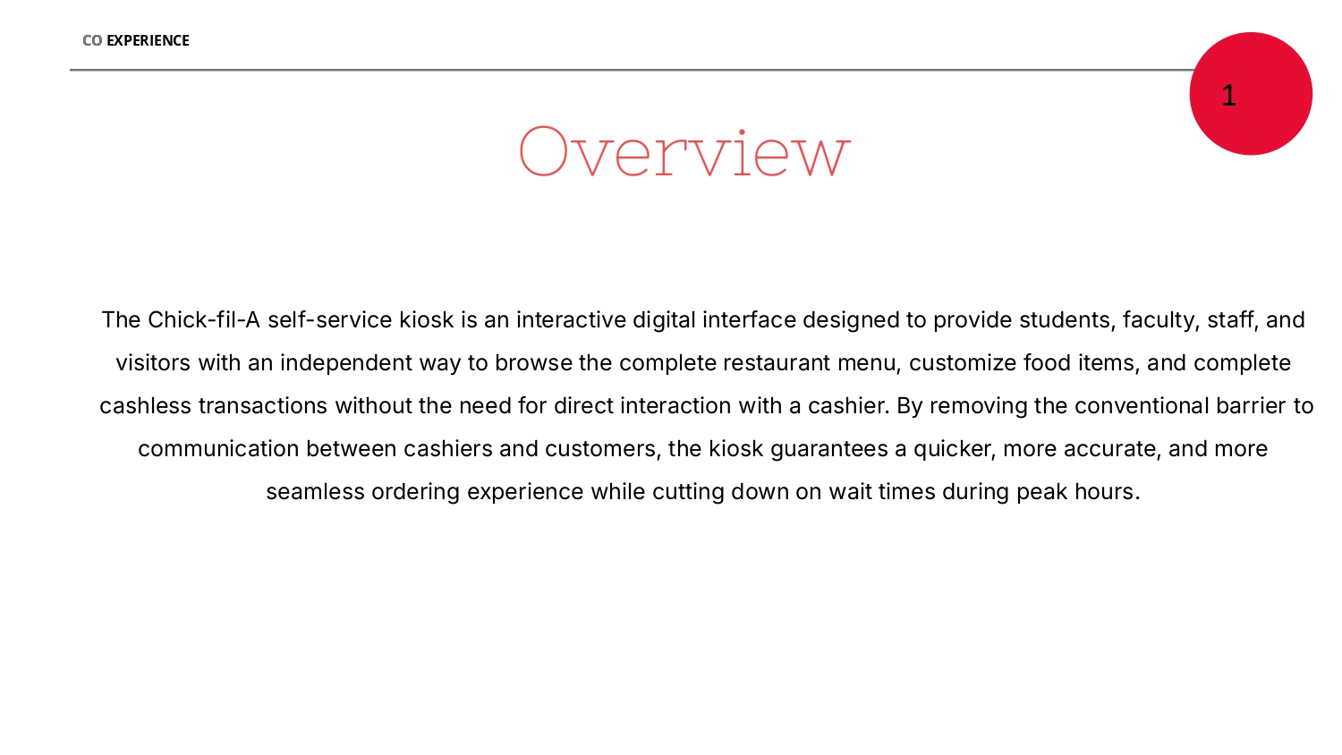
The Chick-fil-A self-service kiosk on campus is a digital ordering interface allowing students, faculty, staff, and visitors to browse the menu, customize items, and complete cashless transactions — designed to reduce wait times during the peak lunch rush.
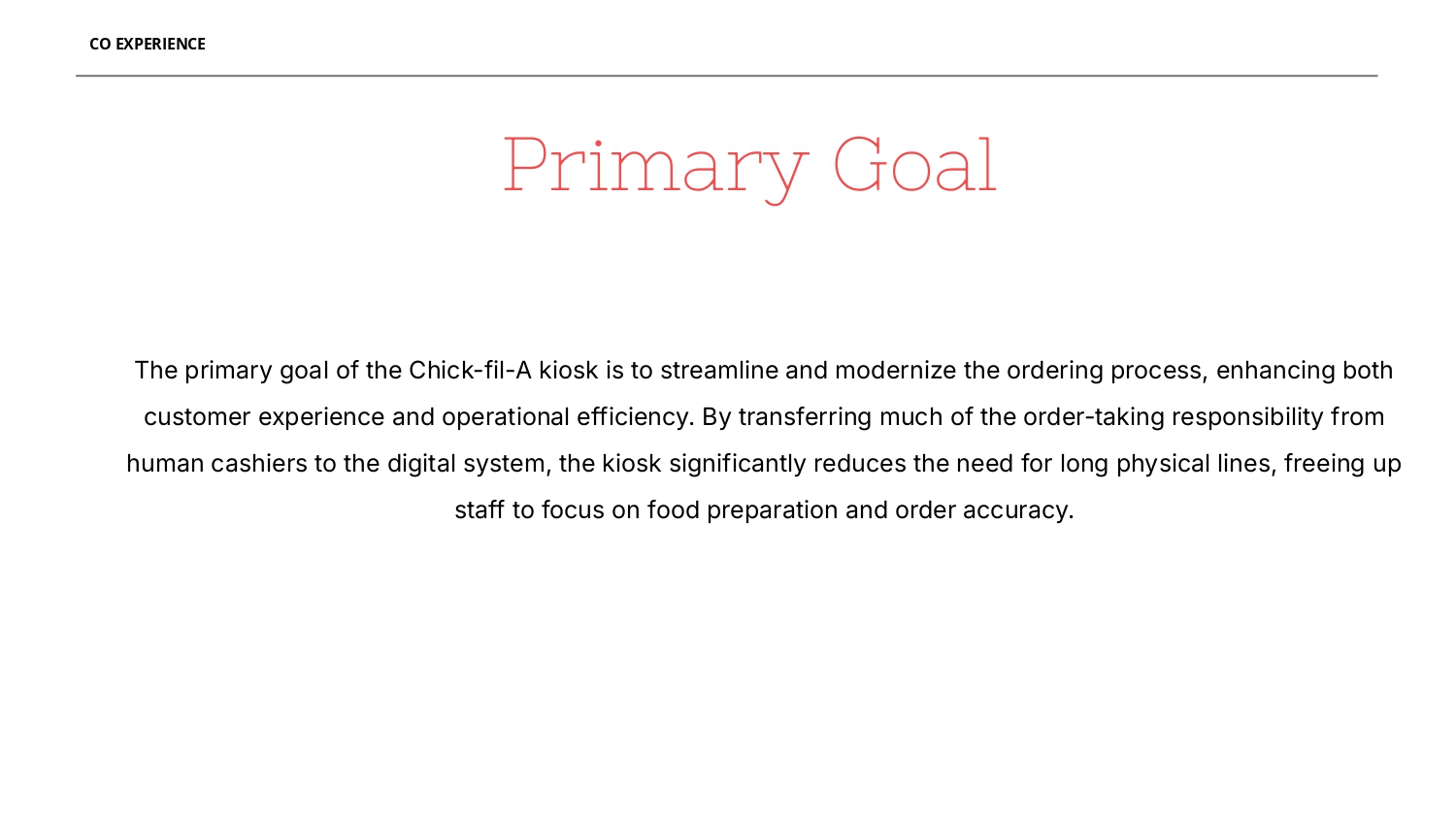
But with increasing campus traffic, the system was showing cracks: long lines, inconsistent order accuracy, and frustrated students trying to order between back-to-back classes.
NC A&T State University campus Chick-fil-A during peak lunch and dinner hours.
Long queues, order inaccuracies, and a kiosk UI that didn't account for time-pressured student users.
Led user persona development and structured the focus group interview frameworks across all three user groups.
Research report with three evidence-based UX improvement proposals backed by focus group findings.
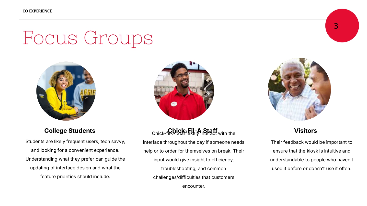
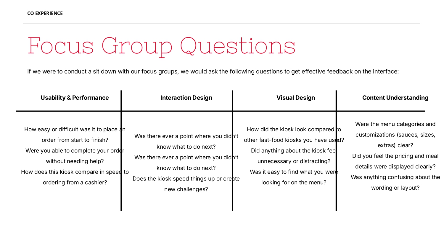
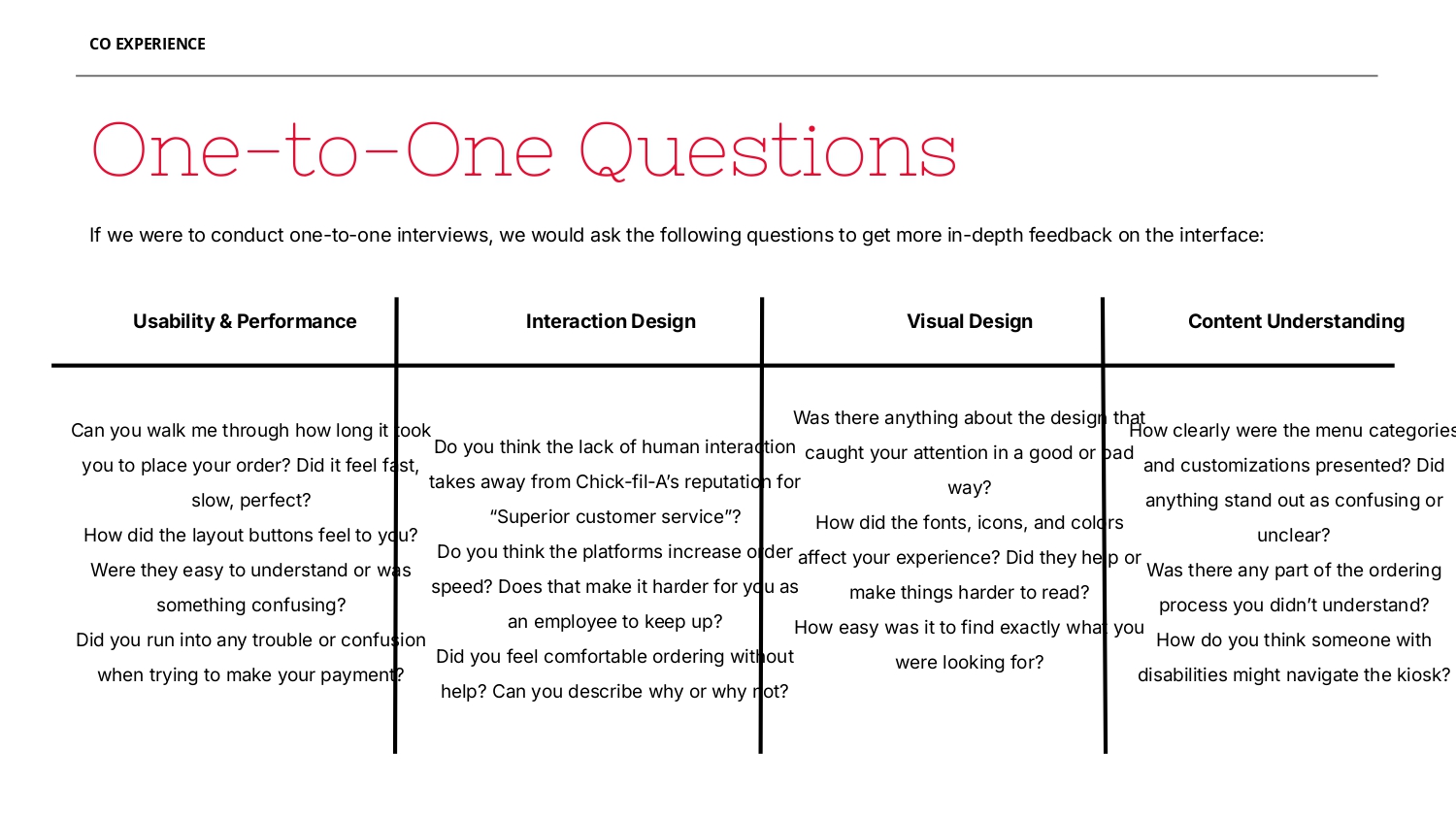
We identified three distinct user groups who interact with the kiosk differently, each with their own priorities and pain points. For each group, we developed structured interview frameworks covering four dimensions: usability, interaction design, visual design, and content understanding.
Usability: Can users complete tasks efficiently? Where do they get stuck, hesitate, or make errors during the ordering flow?
Interaction Design: How do users engage with the touch interface? Do button sizes, tap targets, and navigation patterns feel intuitive?
Visual Design: Does the visual hierarchy guide users clearly? Are pricing, item images, and status indicators easy to read under different lighting conditions?
Content Understanding: Can users interpret item descriptions, allergy info, and availability status accurately without staff assistance?
Two user personas were developed from focus group insights to ground the improvement proposals in real behavioral patterns and motivations.
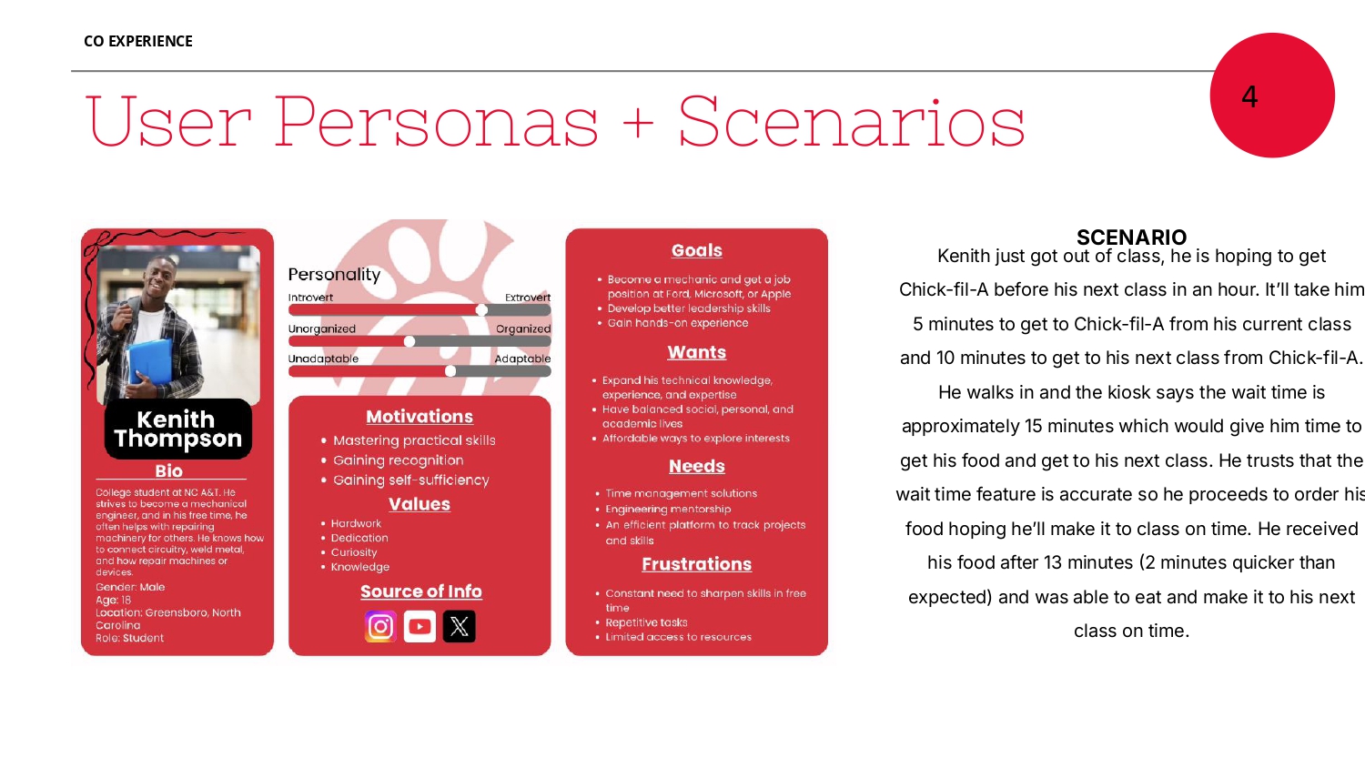
Bio: College student at NC A&T striving to become a mechanical engineer. Spends free time repairing machinery, connecting circuitry, and welding metal.
Motivations: Mastering practical skills, gaining recognition, gaining self-sufficiency.
Goals: Land a position at Ford, Microsoft, or Apple. Develop leadership skills and gain hands-on experience.
Frustrations: Constant need to sharpen skills in free time, repetitive tasks, limited access to resources.
Scenario: Kenith just got out of class and wants Chick-fil-A before his next class in an hour. The kiosk shows a 15-minute wait, which works for his schedule. He trusts it, orders, and receives his food in 13 minutes — 2 minutes faster than expected — making it to class on time.
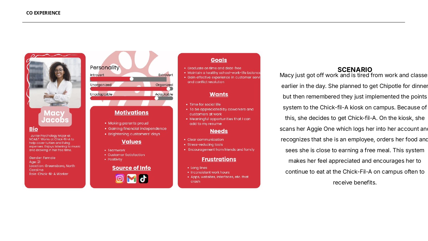
Bio: Junior Psychology Major at NCA&T. Works at Chick-fil-A to help cover tuition and living expenses. Enjoys listening to music and drawing in her free time.
Motivations: Making parents proud, gaining financial independence, brightening customers' days.
Goals: Graduate on time and debt-free. Maintain a healthy school-work-life balance and gain effective customer service experience.
Frustrations: Long lines, inconsistent work hours, apps and interfaces that crash.
Scenario: Macy just got off work and remembers the campus kiosk now has a points system. She scans her Aggie One, which logs her in as an employee. She orders her food and sees she is close to earning a free meal — making her feel appreciated and encouraging her to keep eating there.
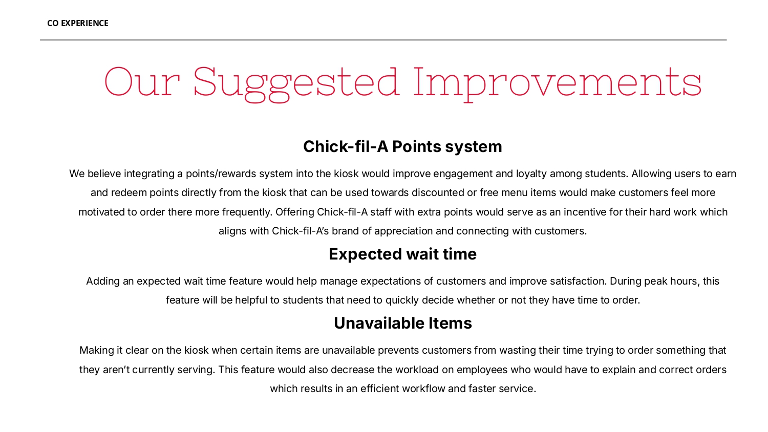
Each proposal emerged directly from patterns observed across focus groups — not assumptions, but documented friction points that multiple user types confirmed independently.
Integrate Chick-fil-A One rewards visibility into the kiosk UI. Show current point balance on the home screen, allow in-session reward redemption without staff, and send a post-order points confirmation.
Show a live or estimated wait time before and during the order flow. Time-pressured students can make informed decisions about whether to order now or come back — reducing abandoned queues and frustration.
Clearly mark sold-out or temporarily unavailable items before users select them. A greyed-out state with a short explanation eliminates the most common source of order errors and staff interruptions.