A hyper-local restaurant discovery app built exclusively for Greensboro, NC — celebrating locally-owned spots through community-driven recommendations.
Type
Mobile App UX Design
Tools
Figma · Illustrator
Duration
~1 Month
Fidelities
Lo → Mid → Hi
Role
Solo Designer
01 / Overview
Why 336 Eats?
I designed 336 Eats because I noticed a real gap in how people discover restaurants in Greensboro. Platforms like Yelp and Google Maps are built for everywhere, which means they're not really built for anywhere specific. Reviews come mostly from one-time visitors, chain restaurants get prioritized, and the local gems that actually make Greensboro worth eating in get buried.
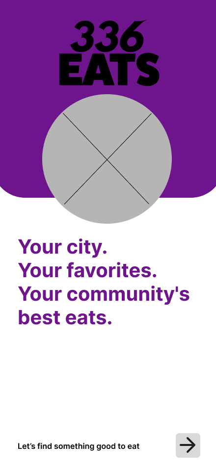
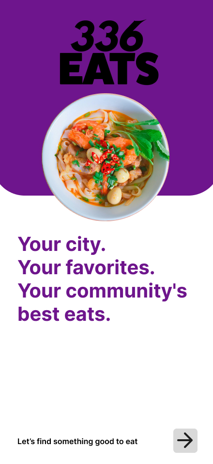
The name comes straight from the city's area code — it's immediately recognizable to locals and signals to everyone else that this app is rooted in place. The goal was a community-first platform where people who actually live here guide the recommendations.
The Problem
Existing platforms prioritize chain restaurants and surface reviews from one-time visitors rather than locals who genuinely know Greensboro's dining scene.
The Solution
A hyper-local, mobile-first app focused exclusively on Greensboro's independent restaurants — recommended by verified locals.
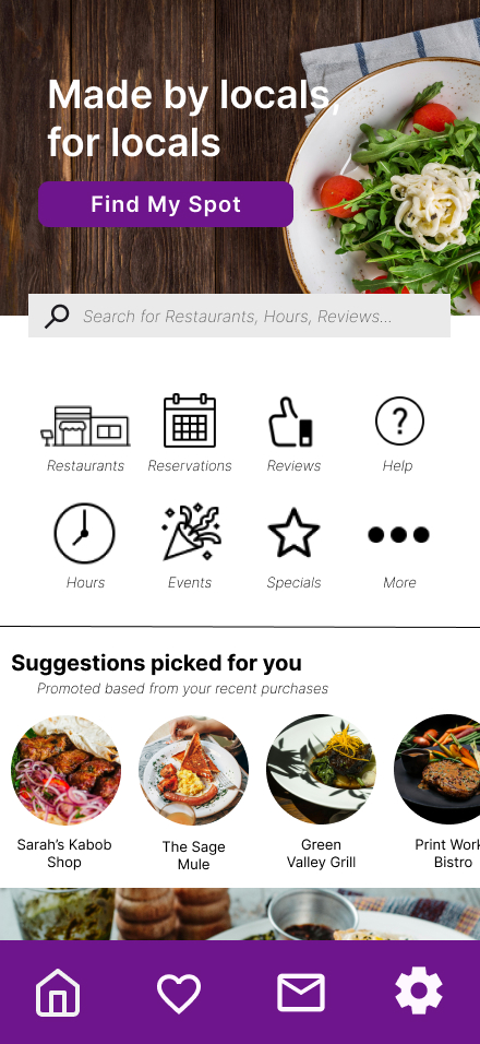
Brand Identity
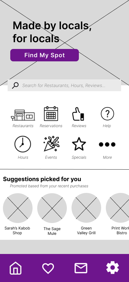
Bold purple palette chosen to feel creative, premium, and distinctly local — nothing corporate, nothing generic. Built in Illustrator alongside the Figma wireframes.
Key Challenge
Keeping fonts, colors, and imagery cohesive across screens while sourcing quality visuals that felt authentic to Greensboro's food culture.
02 / Interactive Prototype
Try It Yourself
Click through the high-fidelity prototype below and interact with 336 Eats as if it were a real app. Navigate between screens, tap buttons, and explore the full user flow directly on this page.
Use your mouse or trackpad to tap through the prototype. Press R to restart from the beginning.
03 / What's Already Out There
What's Already Out There
Before designing anything, I looked hard at what already existed and where each platform fell short for a Greensboro-specific audience.
Yelp
Strong review ecosystem
Generic national feel
Large user base but prioritizes chains and surfaces reviews from one-time visitors over community regulars.
Google Maps
Ubiquitous & trusted
Discovery is secondary
Navigation-first platform — restaurant discovery feels like an afterthought, not a core experience.
TripAdvisor
Deep review content
Tourist-oriented
Skews heavily toward out-of-town visitors, not the locals who eat at the same spots every week.
336 Eats
Hyper-local focusCommunity-first
Exclusively Greensboro, exclusively independent restaurants, exclusively local voices. The gap none of the others fill.
04 / Who Is This For?
Who Is This For?
Three personas guided every design decision — from navigation patterns to how reviews are surfaced.
MT
Marcus Thompson
32 · Marketing Manager · Local Foodie
Goal: Discover new spots and support local businesses — wants to feel like an insider, not a tourist.
Frustration: Yelp keeps surfacing chains he already knows. He wants hidden gems, not the same top-10 list everyone has.
JP
Jennifer Park
38 · Attorney · Busy Parent
Goal: Quick, reliable picks for both family dinners and client lunches — needs to trust the recommendation fast.
Frustration: Too many options with no local context. She wants to know what a Greensboro regular would actually order.
DC
David Chen
28 · Software Engineer · Monthly Visitor
Goal: Find authentic local spots when he visits from Raleigh — wants to eat like he lives here, not like he's passing through.
Frustration: Google Maps gives him the same chains he can find at home. He wants the real Greensboro.
Each screen went through three rounds of design — starting with lo-fi sketches to nail down structure, mid-fidelity grayscale wireframes to establish layout and hierarchy, then full-color high-fidelity mockups with real content and branding applied.
High-FidelityFull color · Real content · Brand applied
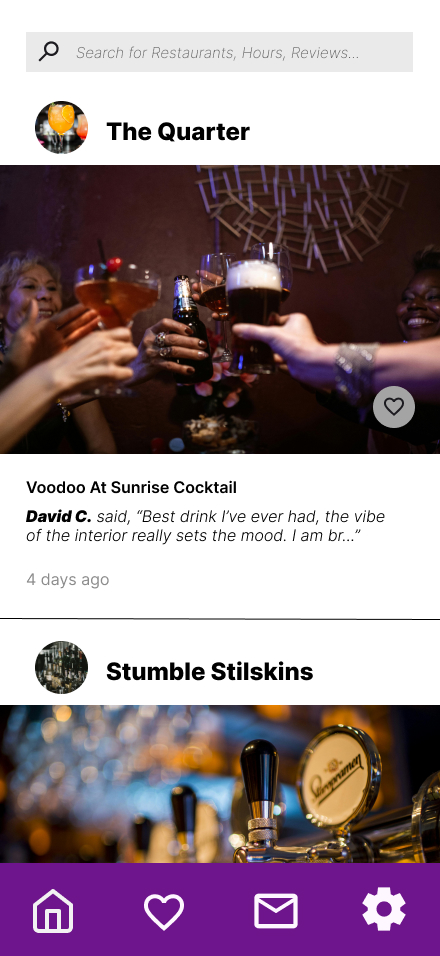
Home Screen
Landing / Discovery
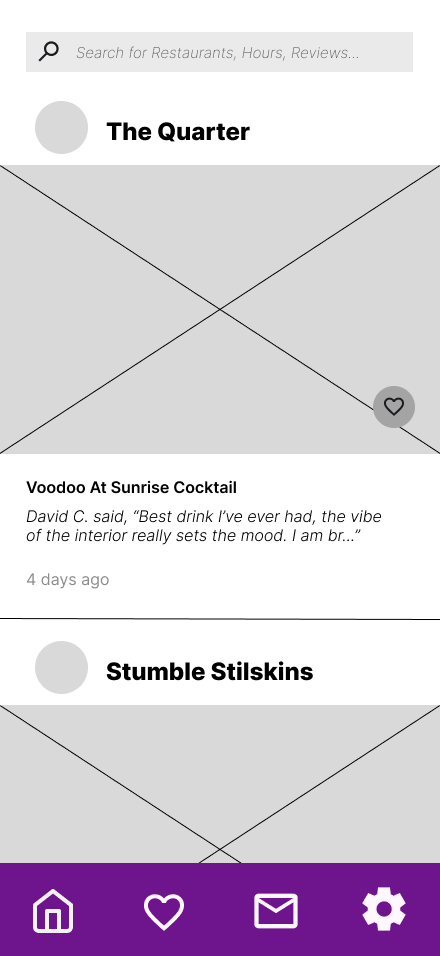
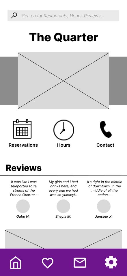
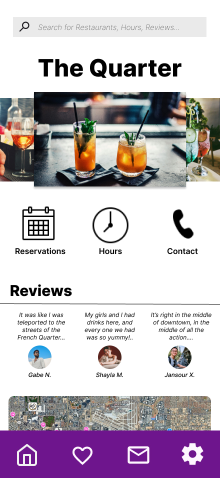
Restaurant Page
Detail Screen
06 / Brand Identity
Color, Type & Voice
The brand was built in Illustrator alongside the wireframes. Purple was the intentional choice — it communicates creativity and a sense of premium quality without feeling corporate. The tagline "Your city. Your favorites. Your community's best eats." puts the community at the center of the entire product.
Primary Purple #7C3AED
Mid Purple #A855F7
Lavender #E9D5FF
Dark Base #1A1A2E
White #FFFFFF
Inter — Primary Typeface"Skip the chains. Eat local.""Made by locals, for locals."336 = Greensboro Area Code